As a designer, it is important for me to be willing to use the products/services that I design. Case in point as you saw with the Plume project, I will design cigar branding but will not touch cigarette branding, both of which are a moot point in Canada. Speaking of moot points, I have no issue designing labels and advertisements for poppers, an inhalant used to facilitate sexual activity primarily but not exclusively by gay men/AMAB people.
When the head of Best Solvents hired me to design for his three initial lines, I jumped at the chance. After all, I am an openly queer designer and this is designing for part of my community.
The first label, Key Hole, has a 1970s motif in colour and visual style as a reference to that era of design and the concept of a key party.
The first label, Key Hole, has a 1970s motif in colour and visual style as a reference to that era of design and the concept of a key party.
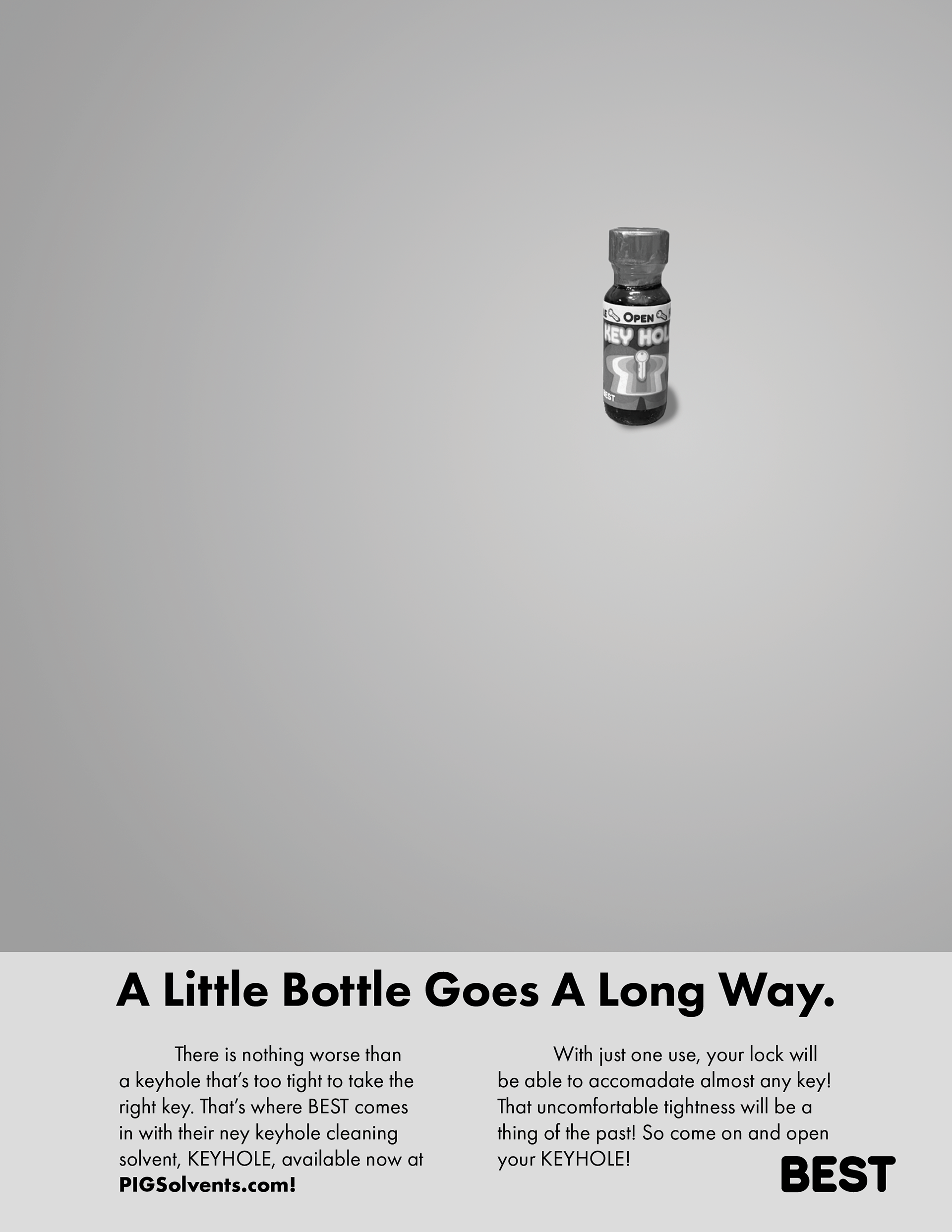
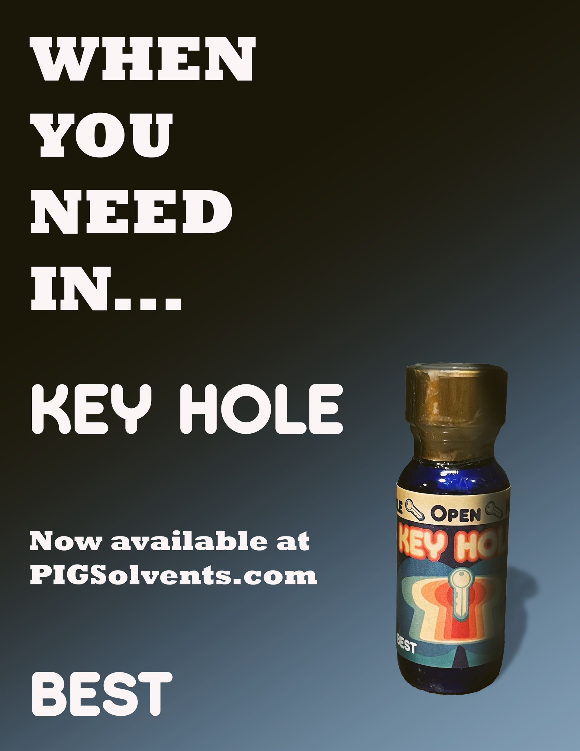
Keeping in touch with the retro feel, 2 ads were developed based on ads from the 1960s and 70s.

An ad for Key Hole that parodies a classic car ad

This Key Hole ad follows a very simple 1970s style product shot ad, using a simple gradient and large type.
Lily is meant to be marketed toward women who use poppers. They are out there. Taking real world experience and research that comes with knowing the community that would want this product, I focused on deep violet and red tones, making the target clear without the possibility of pinkwashing.
The ad for Lily involves some photomanipulation, connecting the use of poppers with a BDSM play.
Deep is a label for heavier play. The image is a reference to the use of hypnosis by the kink community. The typeface is one of my own design called BDA 2HB.
The head of Best/Pig Solvents/2Guys also hosts events and I created simple motion advertisements for Key Hole and Deep. The Deep ad continues the spiral motif.