DropBy Office
A client I have worked with on various projects informed me that he was going to open a shared office space in California and wanted me to do the branding work for it. For the summer of 2022 and continued related work into 2023, DropBy Office is the most extensive project I have had the honour to be a part of. So let's talk about the details. While this will not be a comprehensive study of the entire branding process, this should offer some insight into my work to help bring this company to life.
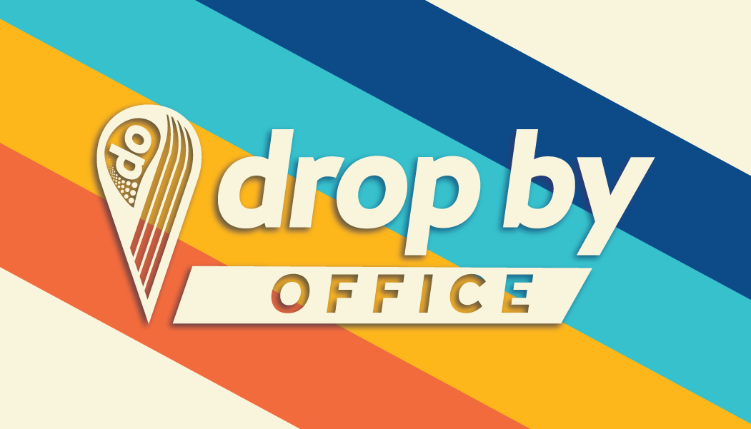
The Logo


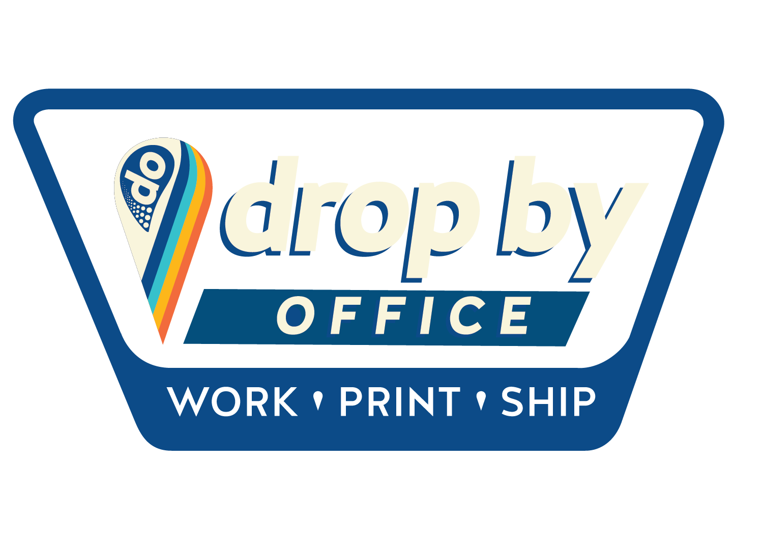
The logo uses the Halis GR type family which is the primary typeface used for advertisements and other branding. The key visual that has remained consistent in the brand is the pin on the lefthand side. This pin is a reference to the location pin found on interactive maps. The colours used are the dominant repeating colours of the brand, evoking the 1970s palettes common to the Coachella Valley region. The most recent variation incorporates Work Print Ship, the tagline of the business as well as an asymmetrical shape, mimicking vintage state park signage.
The other repeating visual motif is the "do" in the eye of the pin. Not only is it the initials of the business, but also an imperative statement that lines up with the things a client can do.
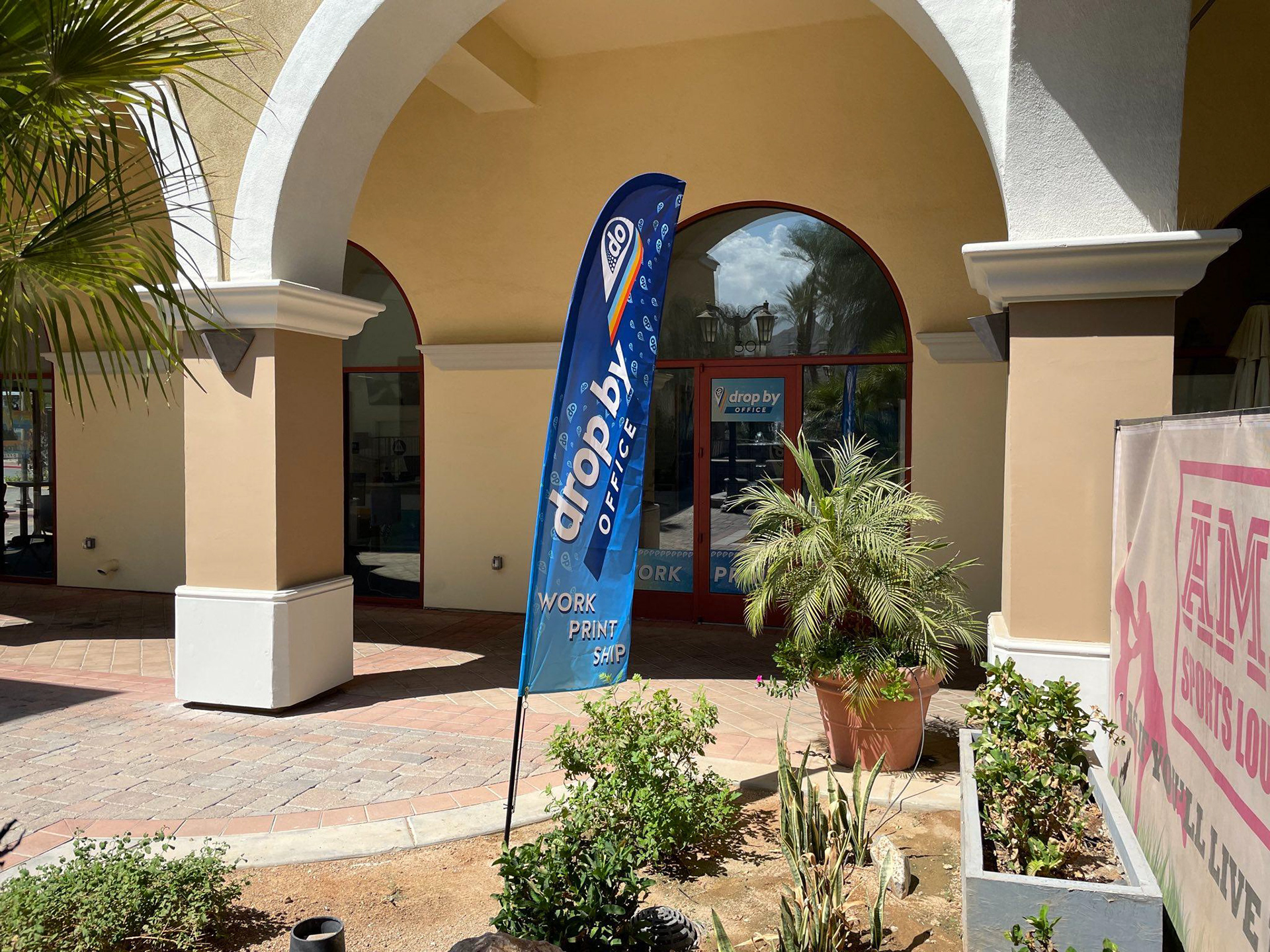
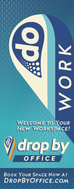
Decor
Part of working on this project meant creating wall, door, and window decoration that could be printed on site or easily procured. This includes the drop flag, small window sign, display counter, hanging signage, and accent wallpaper. Photos are courtesy of Tim at DropBy Office.
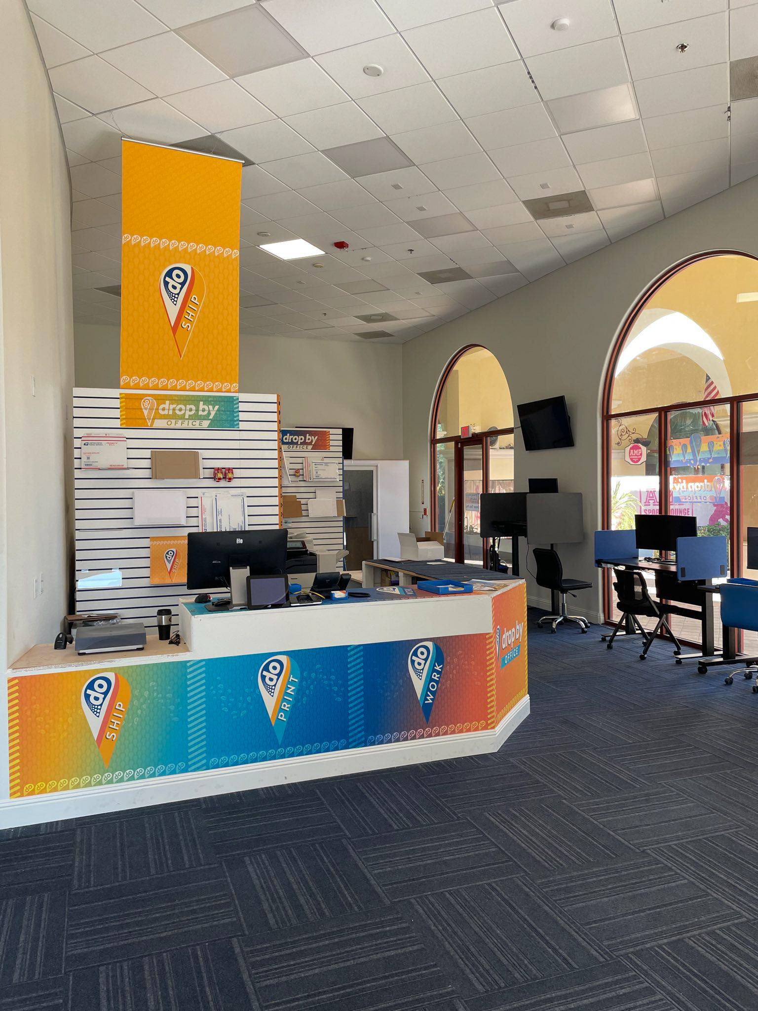
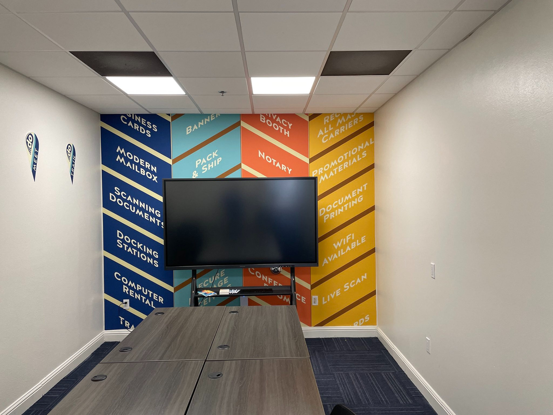
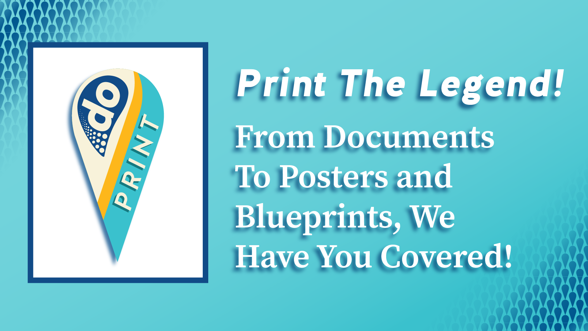
Getting To The Point
The repeating motif of the logo within the shop is the needle and its use for the various sections. The dark blue pin is used for the Work section, utilizing the shared office space, conference area, and podcast recording studio. The teal pin refers to printing related matters. Orange is for shipping, and red is for other business affairs such as notary services.


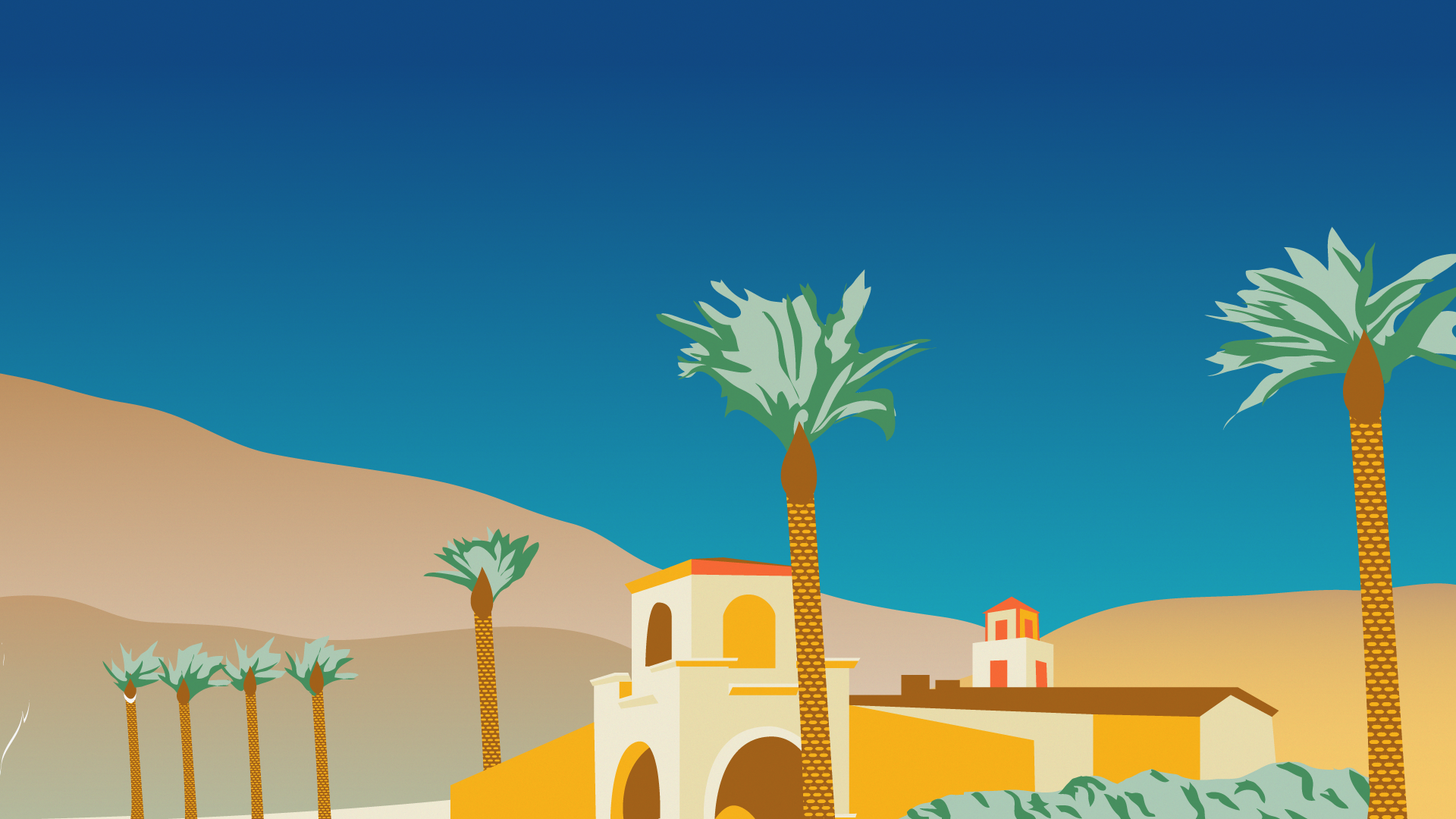
Desktop Backgrounds
As a shared workspace, DropBy has shared computers to rent, which meant ensuring a strong brand presence for the desktops of those systems.

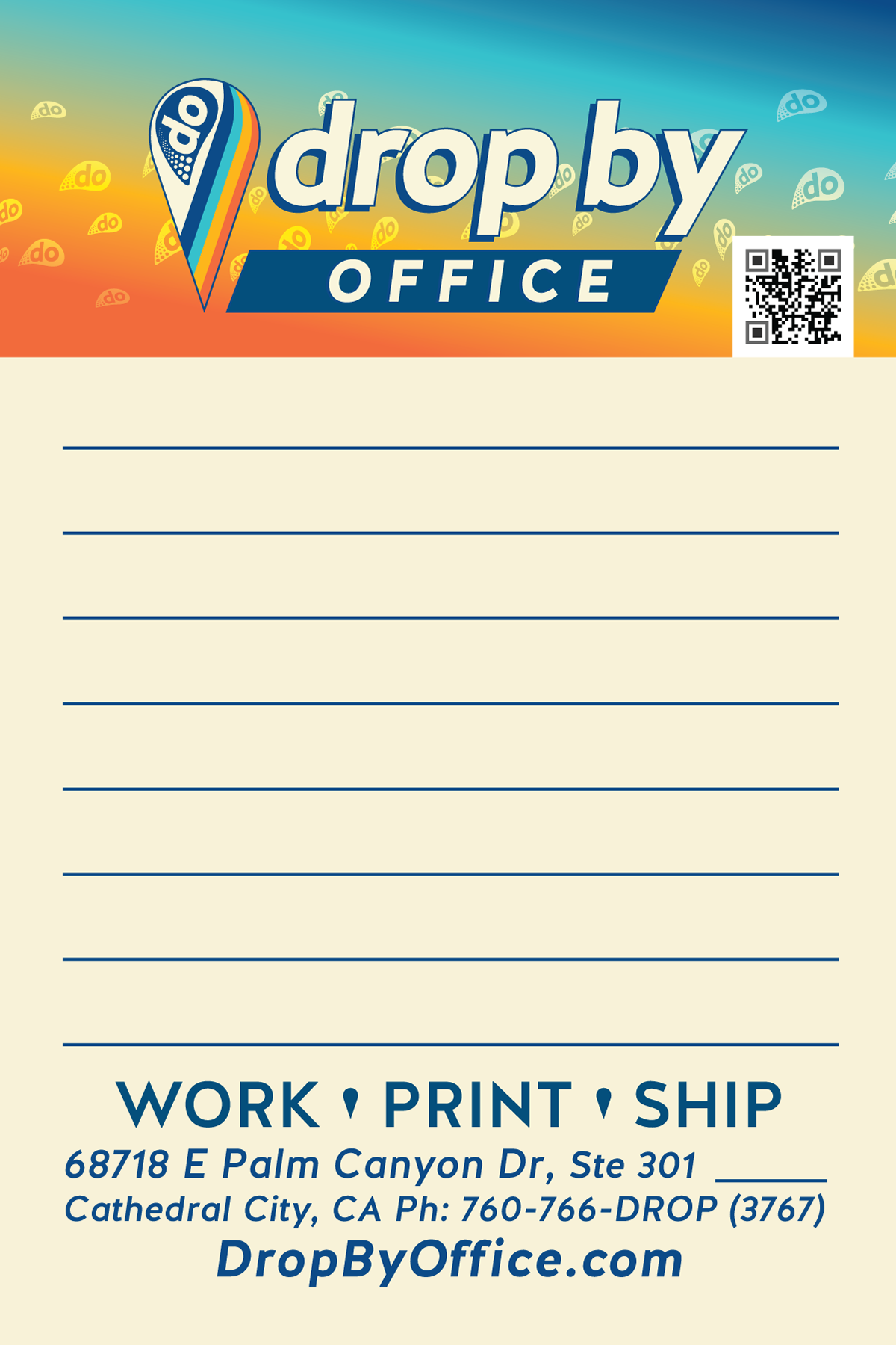
Reading Material
The brochures from DropBy were designed for ease of use: I piece, 2 sides, a third of a US Letter sized page.


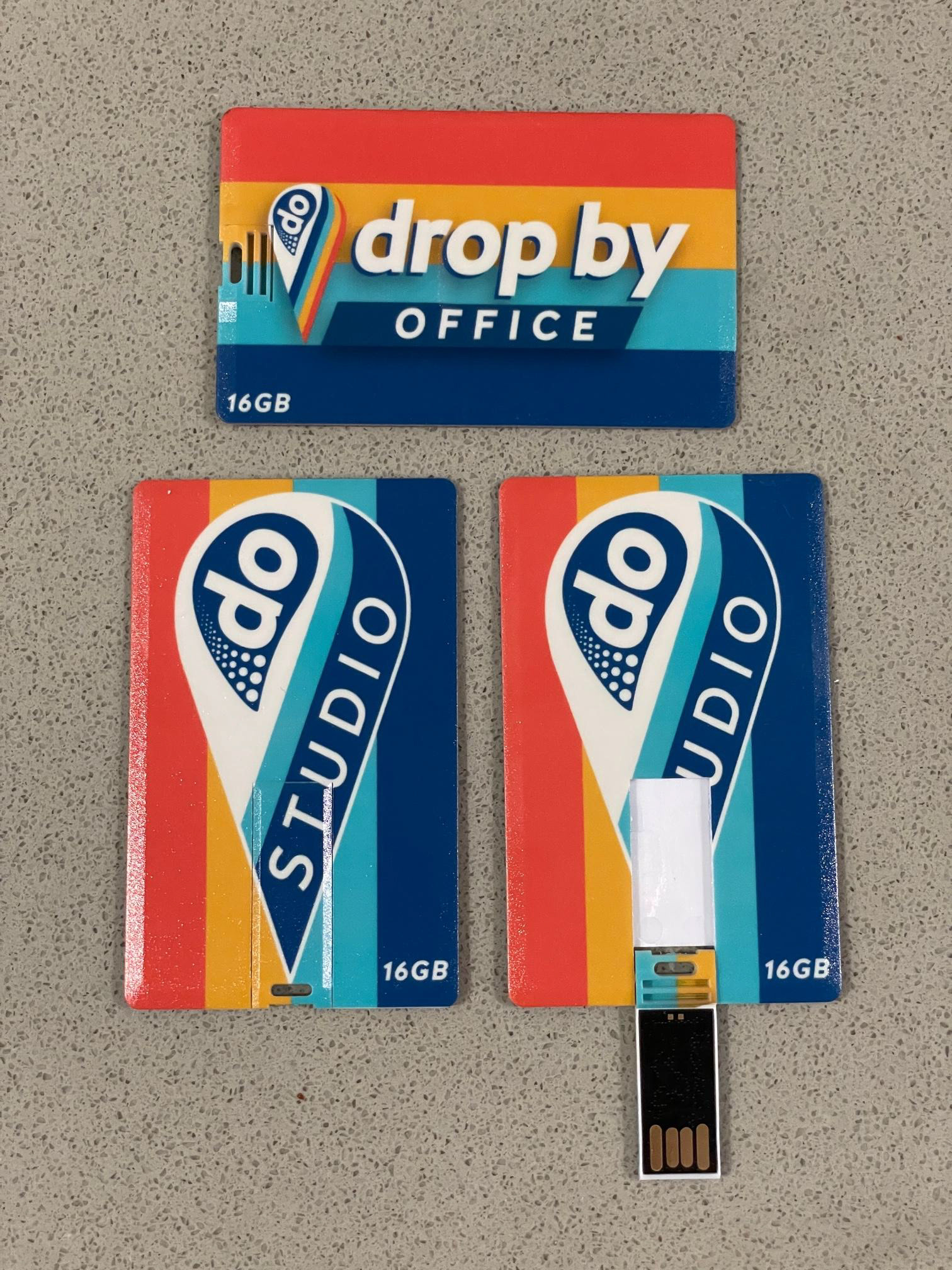
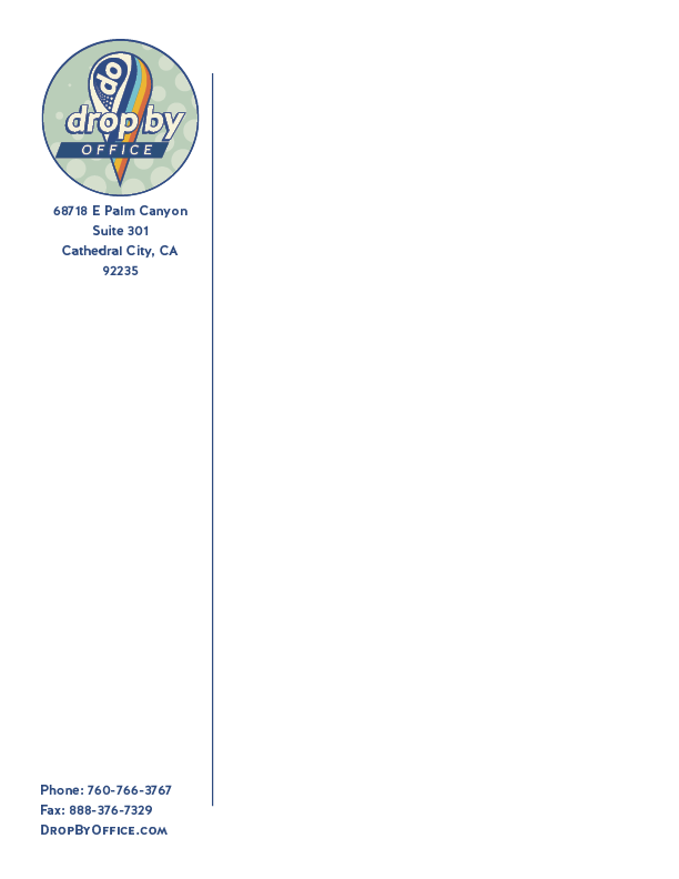
Stationery Things
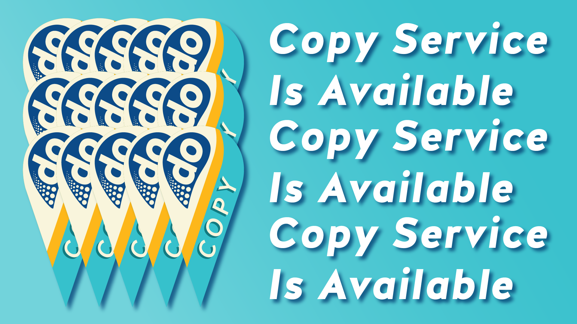
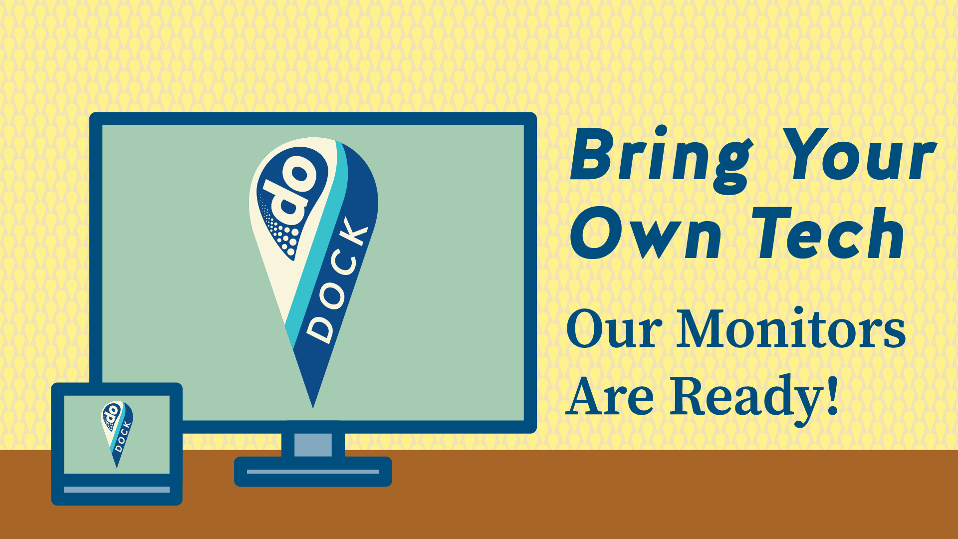
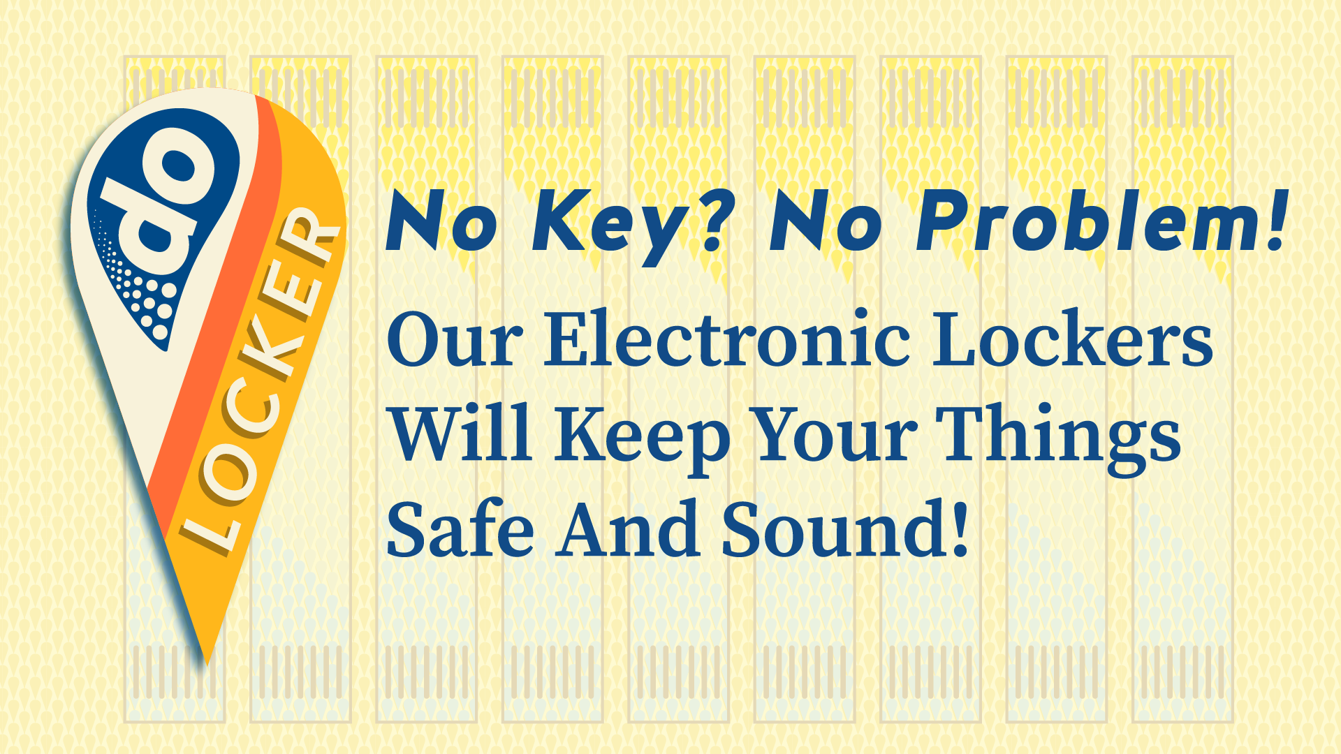
Slideshow Graphics
These graphics play on a loop interspersed with motion graphics advertising the main branches of the business.


While there is a good amount of the work for this project shown here, this is by no means the full extent. For more information on DropBy Office, please visit DropByOffice.com