A Chromadrift sticker design using the raccoon character from Music for Trash Pandas over a simple background.
Working on Chromadrift's Music for Trash Pandas was a very fun exercise in style and illustration. Once the album saw its compact disc pressing, Drew of Chromadrift reached out to inquire about shirt designs. The project scope was four designs, suitable for light and dark colour shirts, as well as a proper wordmark.
As a refresher, here is the artwork for Music for Trash Pandas:
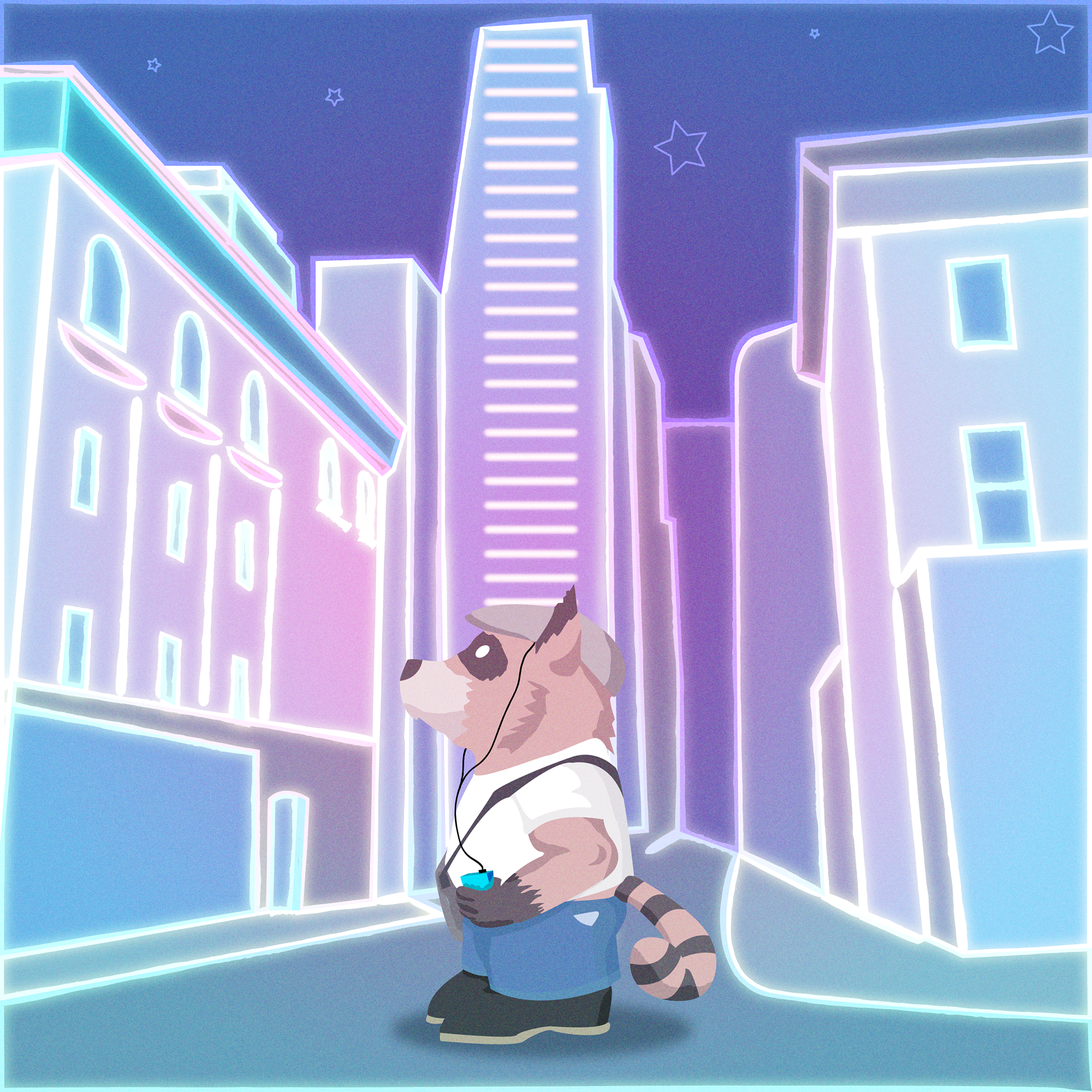
The front cover of Music For Trash Pandas with a small raccoon in a big neon city.
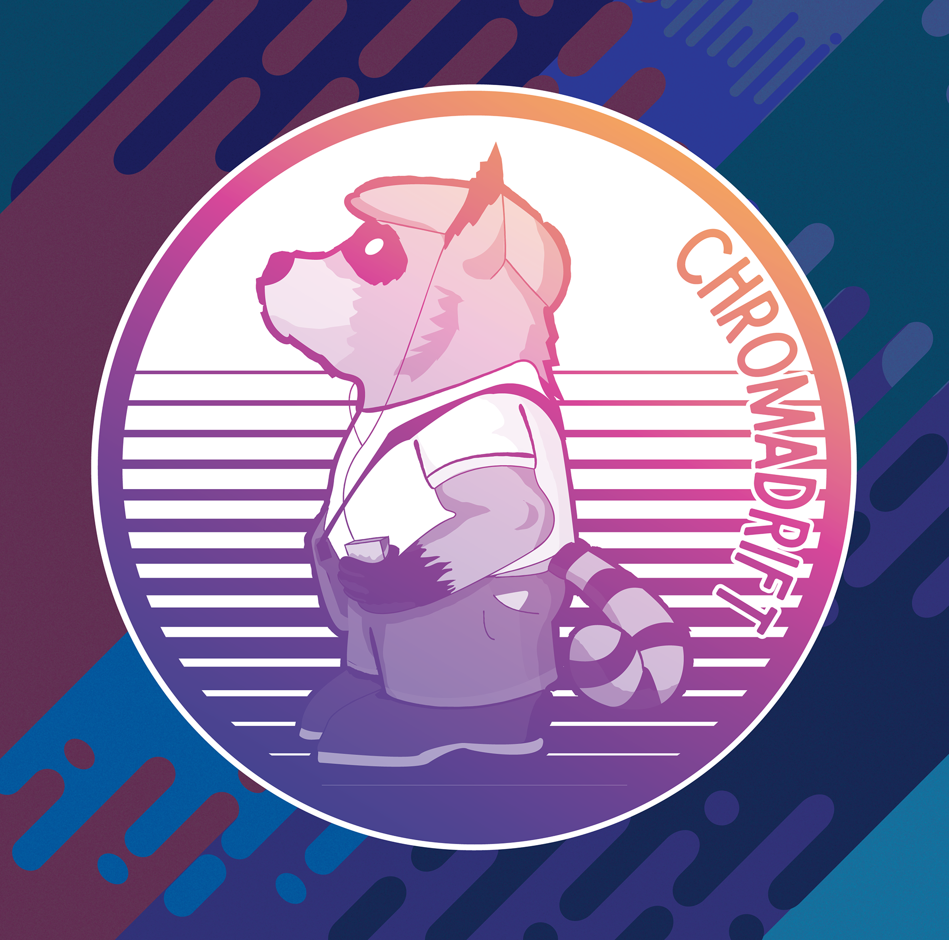
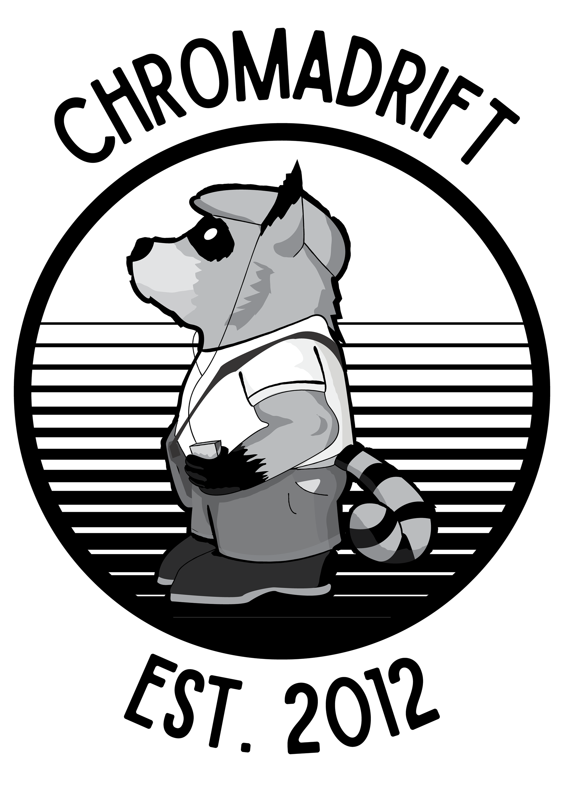
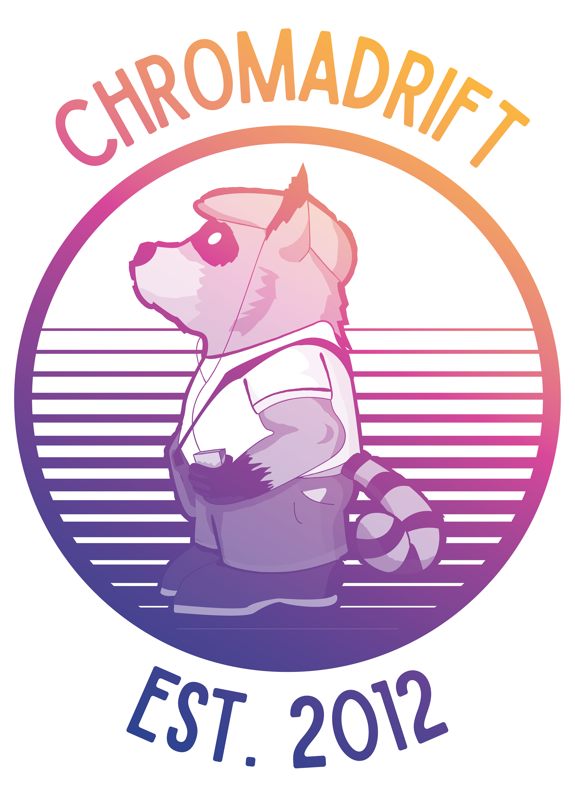
The first design focuses on the raccoon figure, it's almost the same as the sticker design at the top, but the text is outside and there is an added "Est. 2012" as it has been 10 years since Drew started this projects. On the left is the black and white version, and on the right is a gradient version. The version for dark shirts has white around the letters as well as in the circle as a background.
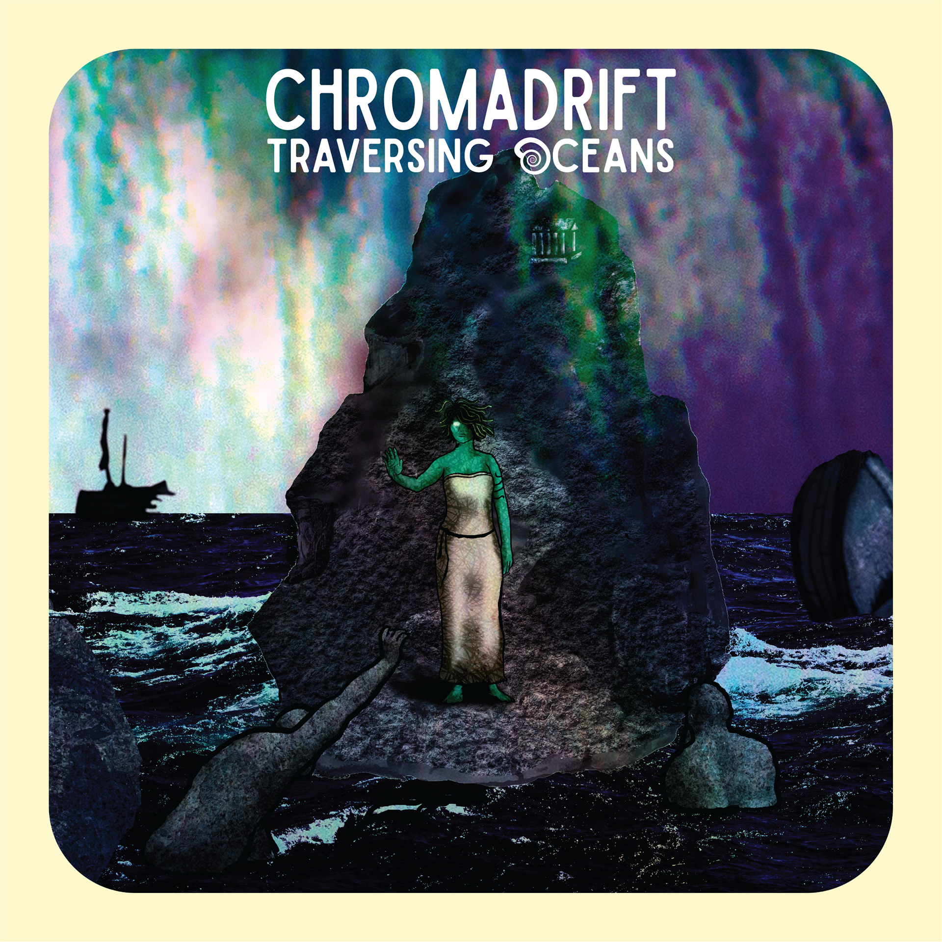
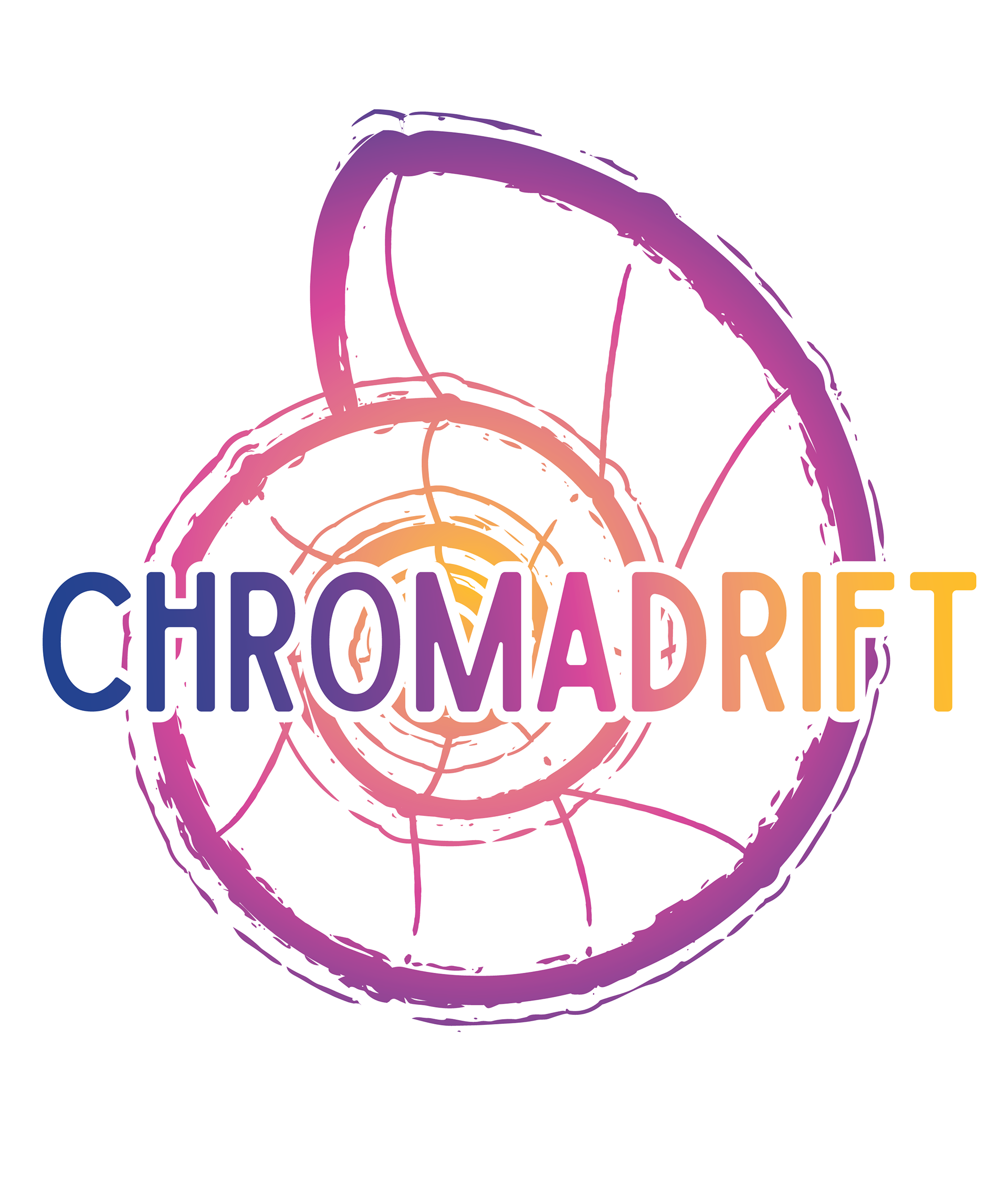
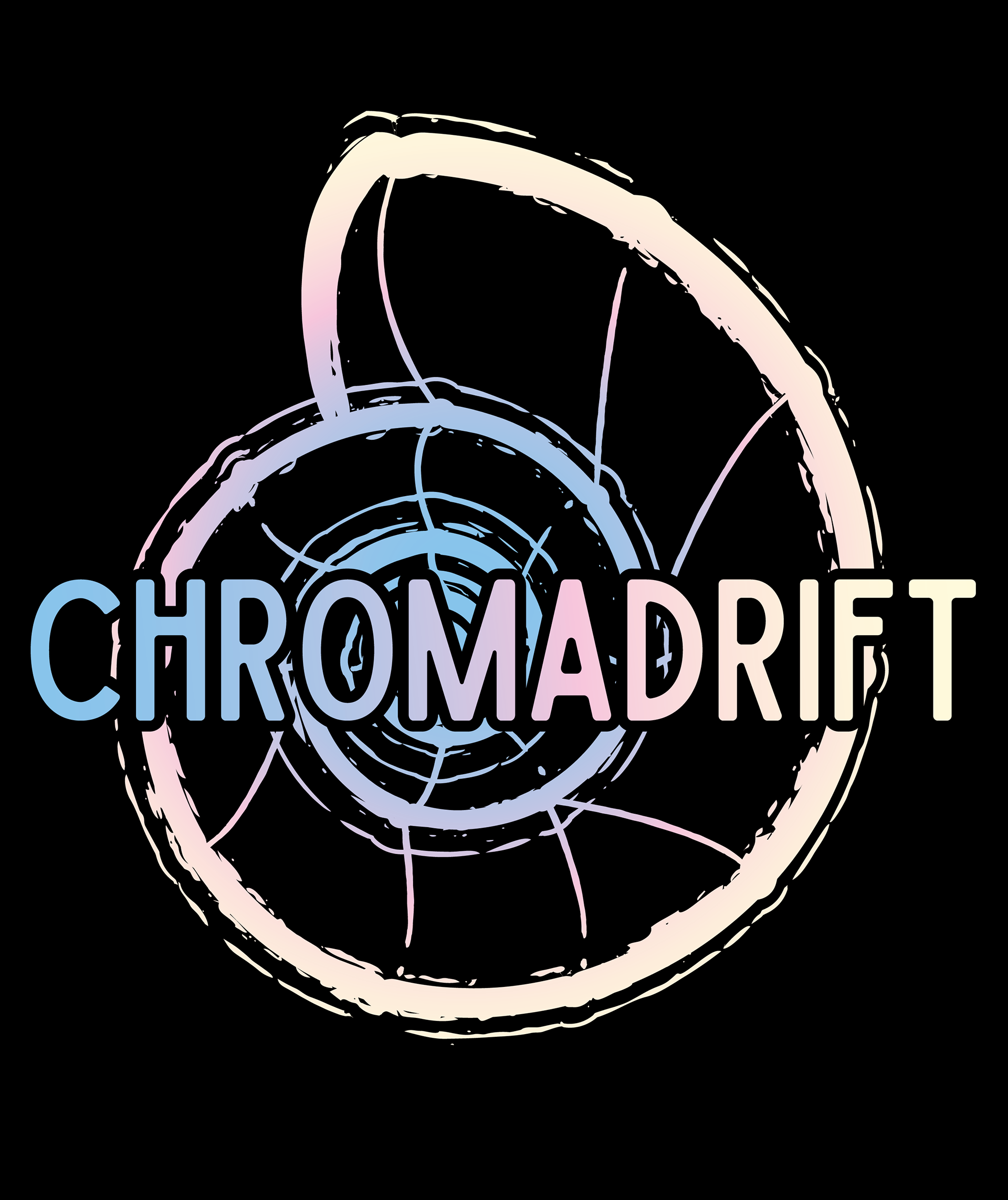
The second design is a stylized nautilus shell with the wordmark in the middle. The wordmark itself is in Sailors Condensed. When designing the cover for the prior album Traversing Oceans, this was the first time it became part of the Chromadrift brand. The nautilus shell that was used on that album cover was the basis for this design. Shown below from left to right are the Traversing Oceans cover, the version of the shell for light shirts, and the version for dark shirts which has a more pastel gradient.
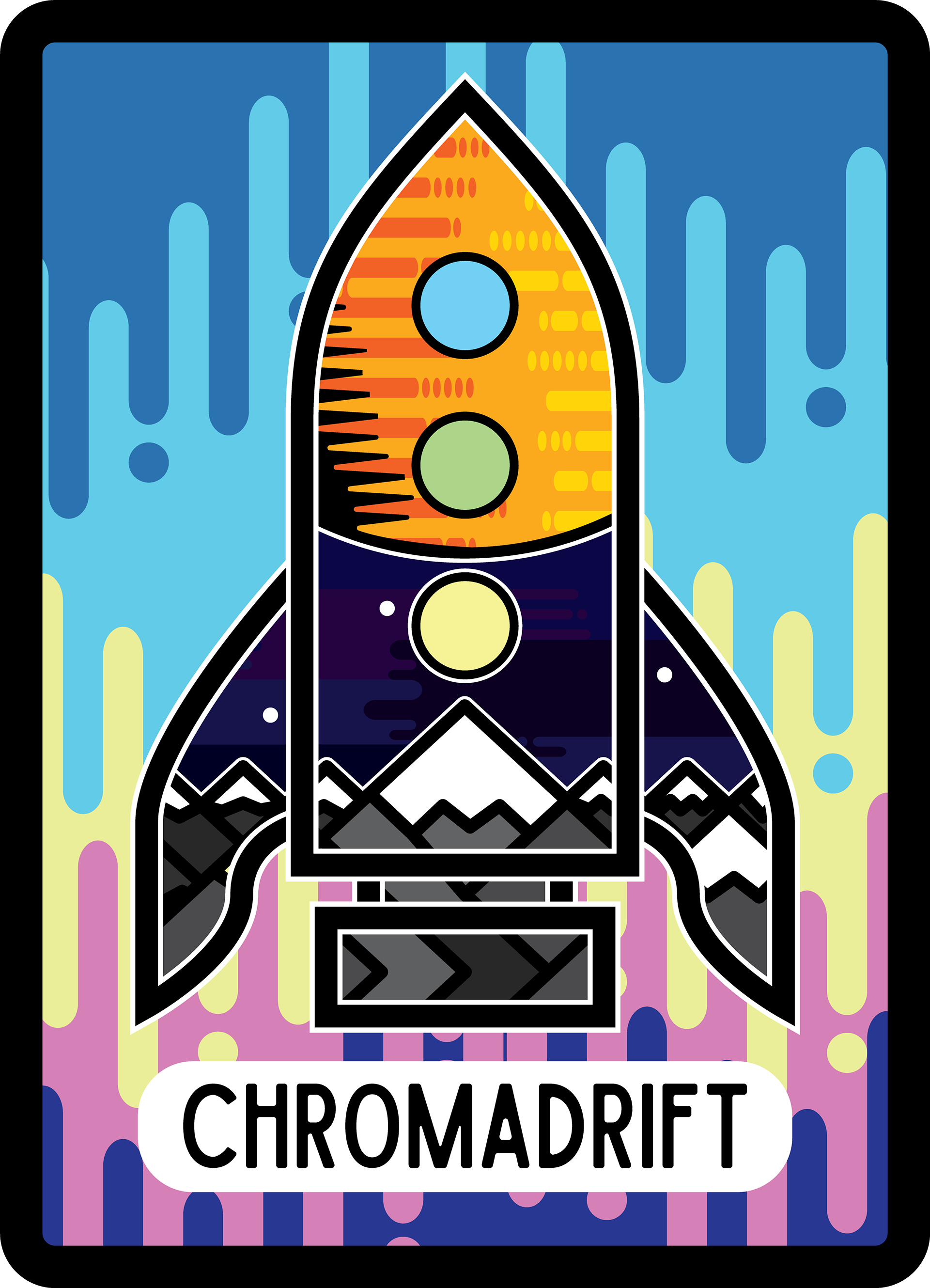
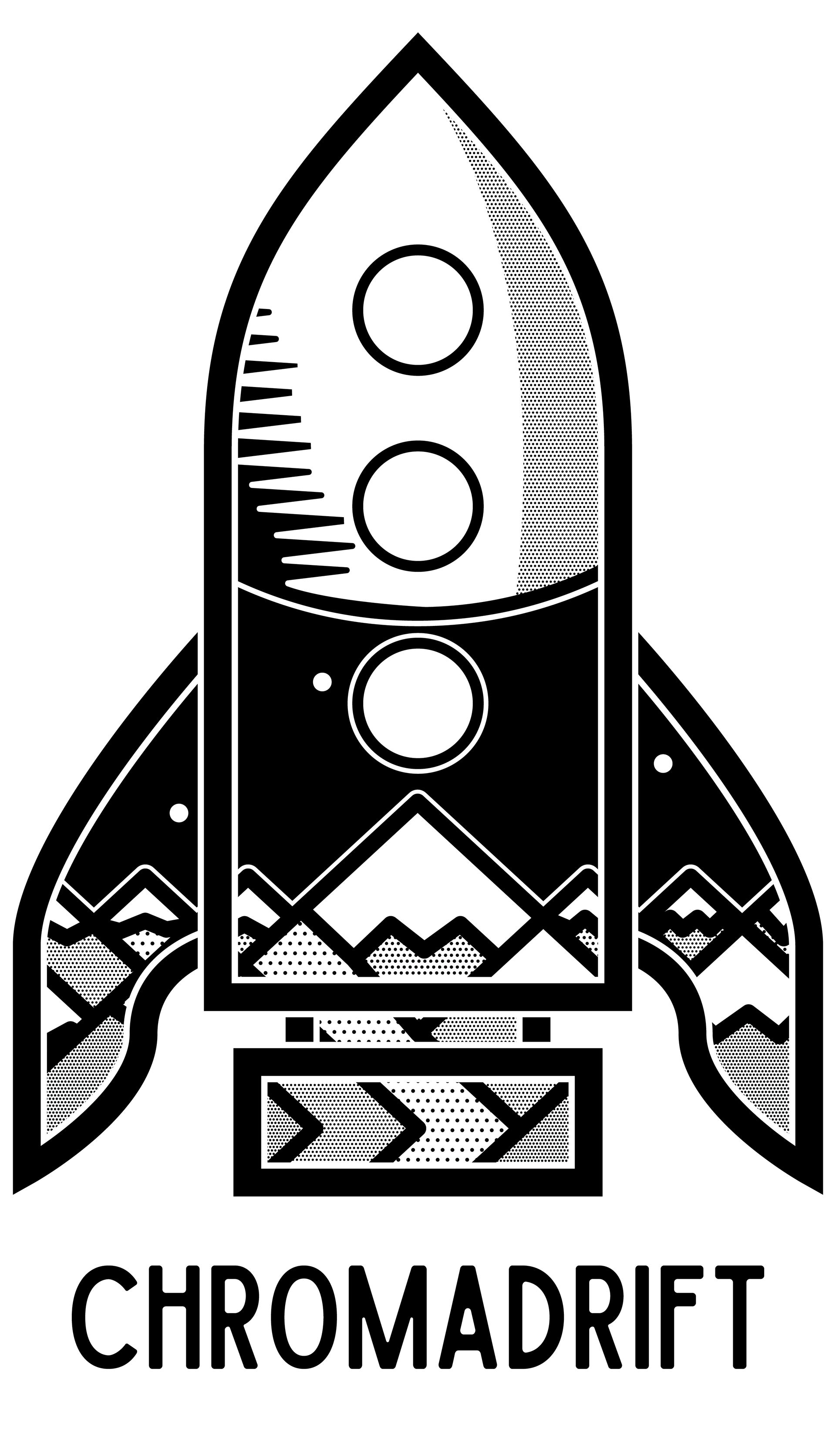
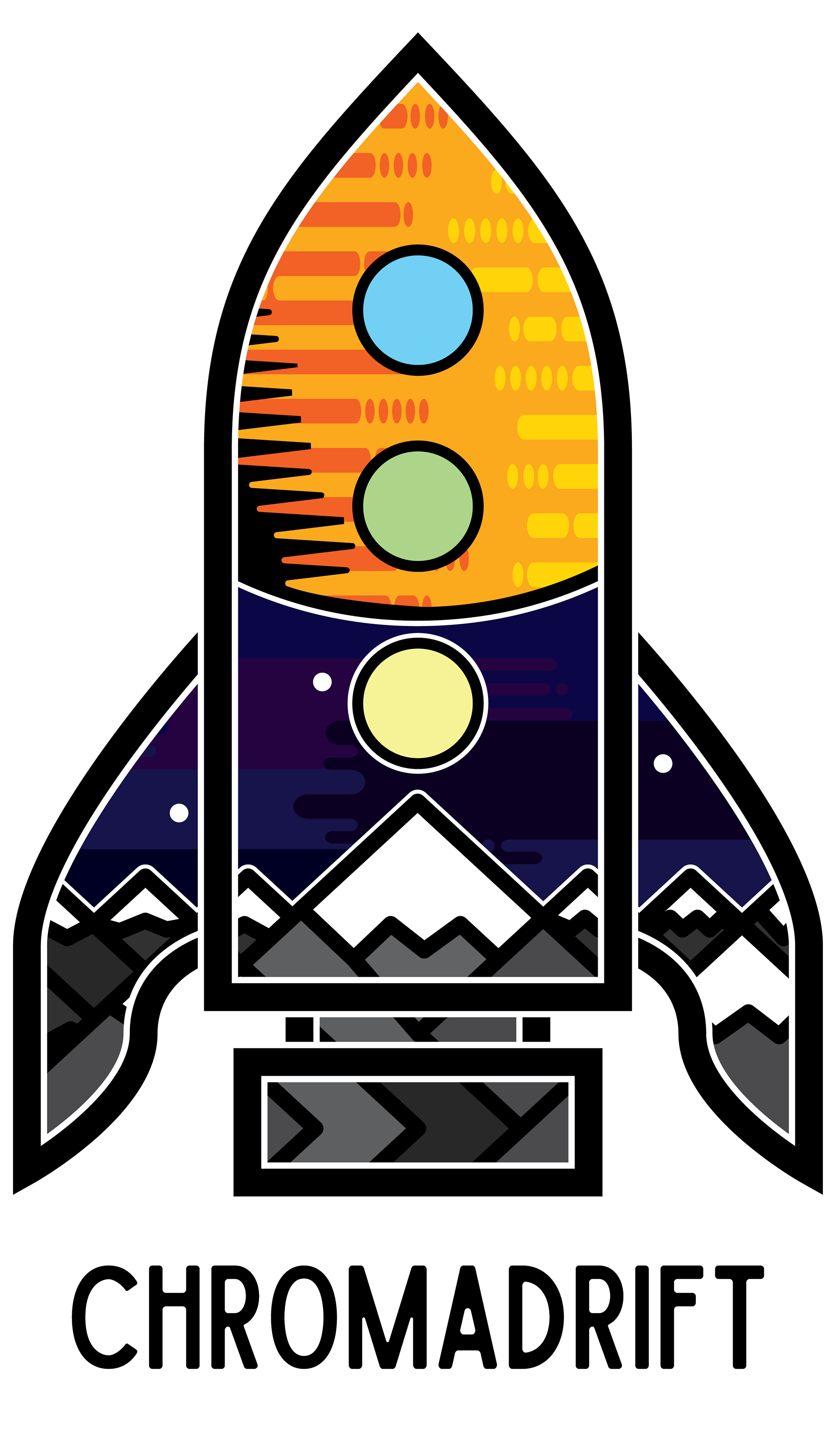
The third shirt and sticker combo is a stylized rocket that contains an image of the mountains, a moon, and a large planet overhead. While this could be considered closer to Drew's Brother Saturn project, that will be a different shirt in the future. Below from left to right, there is the sticker design of the rocket, then the black and white shirt and the colour version of the shirt.
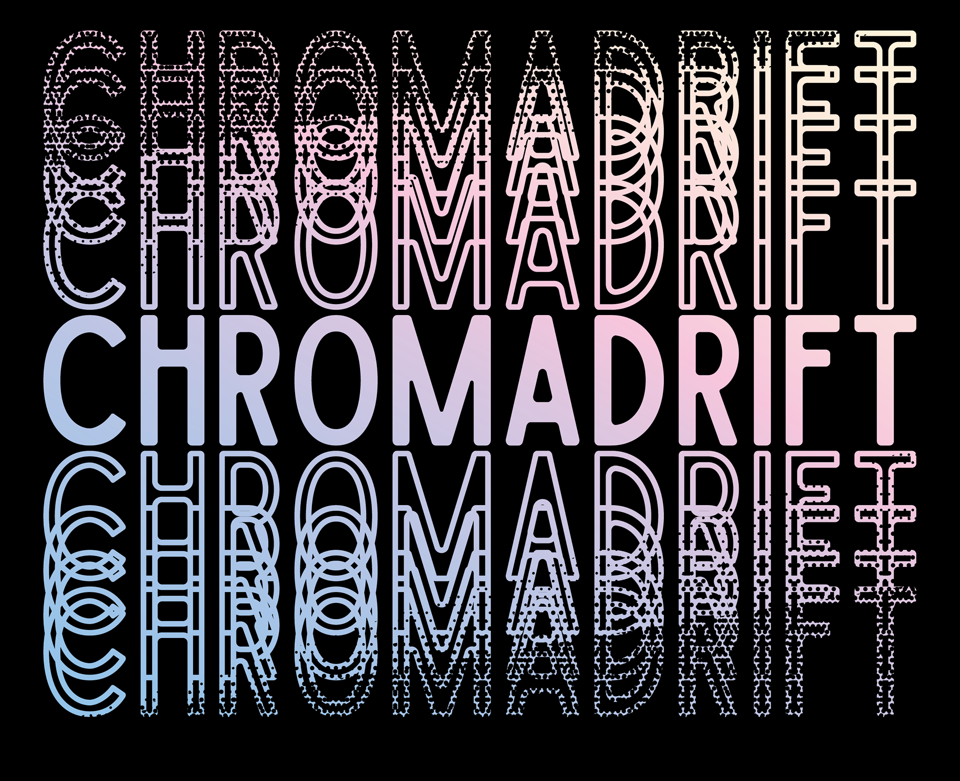
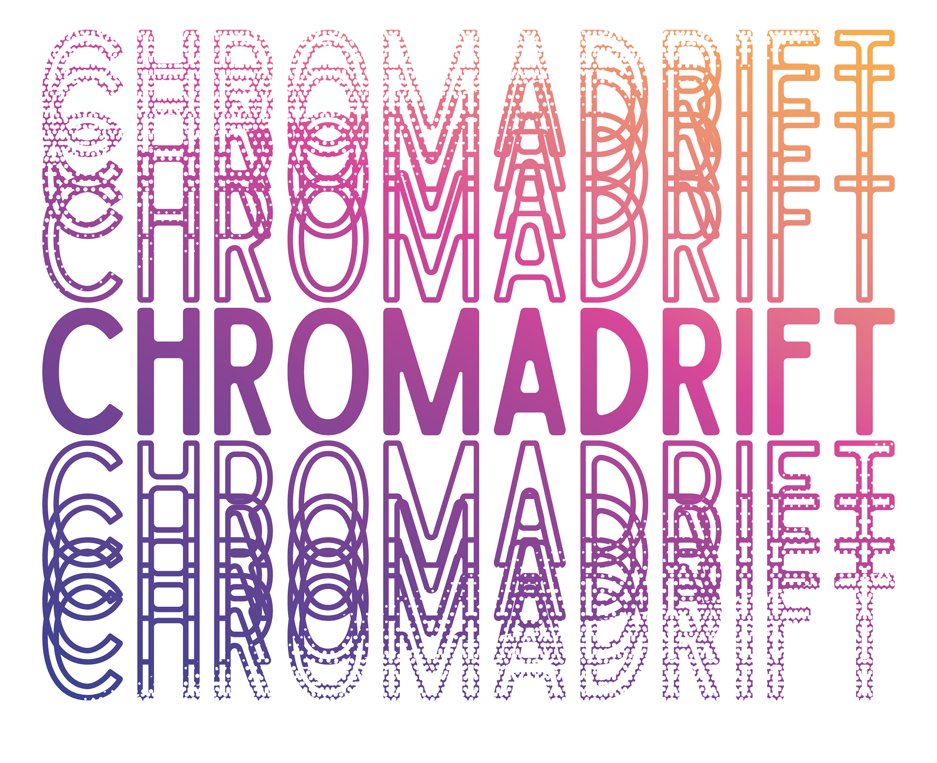
Finally there is the last shirt, which is the name Chromadrift in solid with outlined, overlapping words above and below. Each set has sets of halftone dots, creating an angled solid effect through the logo. The gradients for these are the same as the ones on the nautilus shell shirts. On the left is the dark shirt, and the light version is on the right.